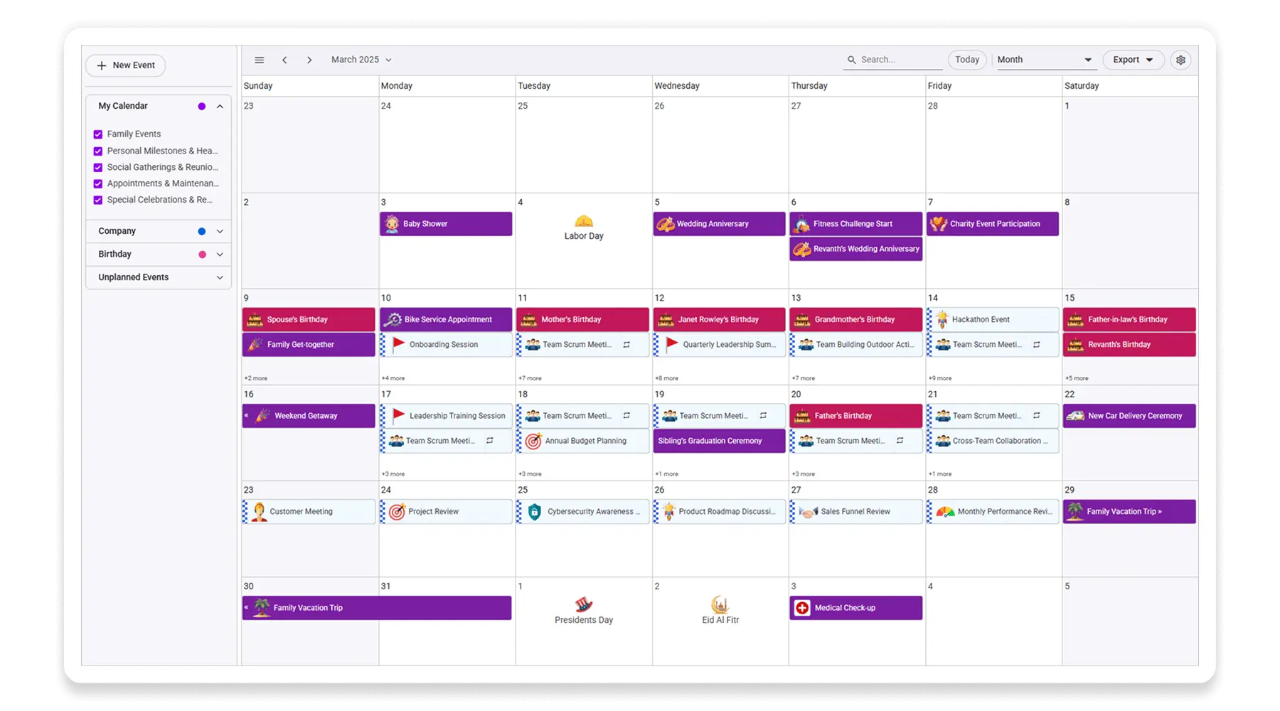
React Scheduler - A Flexible Event Calendar Component
- View vibrant events in different views such as day, week, month, agenda, year, and timeline views.
- Display multiple calendars in a single layout with finely grouped events.
- Customize effortlessly with out-of-the-box, built-in template options.
Quick Overview Video
Trusted by the world’s leading companies

Overview
Explore Live Demo
The React Scheduler, or event calendar, is a fully featured event calendar component that helps users manage their time efficiently. It facilitates easy resource scheduling and the rescheduling of events or appointments through editor pop-ups, drag and drop, and resizing actions.
Why choose Syncfusion React Scheduler?
High performance
The React Scheduler loads data on demand by default to reduce the transfer and load times. Proper field mapping is mandatory while binding Scheduler to data sources with different field names.
Seamless data binding
Bind data seamlessly with various local and remote data sources such as JSON, OData, WCF, and RESTful web services with the help of a data manager.
Built-in views
There are several different built-in view modes available: day, week, workweek, month, agenda, month-agenda, year, and timeline. With a variety of view-specific variables, you can customize each view.
Recurring events
Easily configure recurring events to repeat on a daily, weekly, monthly, or yearly basis with integrated recurrence options.
Multiple resources and grouping
To group resources according to multiple factors, the React Scheduler offers a wide range of flexible options. It also covers scheduling timelines and grouping appointments by resource and date.
Adapts to any resolution
Scheduler has a highly responsive layout and an optimized design for desktops, touch-screens, and smart phones. It works well on all mobile phones that use iOS, Android, or Windows OS.
Attractive customizable themes
Cutting edge design with 5+ built-in themes such as Fluent, Tailwind CSS, Bootstrap, Material, Fabric, and more. Utilize the online Theme Studio tool to customize themes of Scheduler easily.
Globalization and localization
Enables users from different locales to use the Scheduler by formatting dates, currency, and numbering to suit their preferences.
AI Scheduler for Smarter Planning
The AI Scheduler organizes your calendar with ease. Just type instructions like, “Meet the team every Friday at 10 AM”, and it handles the rest. It checks for conflicts, suggests optimal times, and organizes your calendar visually.
React Scheduler Code Example
Easily get started with the React Scheduler using a few simple lines of TSX code example as demonstrated below. Also explore our React Scheduler Example that shows you how to render and configure a Scheduler in React.
import * as React from 'react';
import {
  ScheduleComponent, ViewsDirective, ViewDirective, Day, Week, WorkWeek, Month, Agenda, Inject
} from '@syncfusion/ej2-react-schedule';

const App = () => {
  const data = [{
    Id: 1,
    Subject: 'Scrum Meeting',
    Location: 'Office',
    StartTime: new Date(2022, 0, 1, 9, 30),
    EndTime: new Date(2023, 0, 1, 10, 30),
    RecurrenceRule: 'FREQ=WEEKLY;BYDAY=MO,TU,WE,TH,FR;INTERVAL=1'
  }];

  return (
    <div>
      <ScheduleComponent height='650px' eventSettings=>
        <ViewsDirective>
          <ViewDirective option='Day' />
          <ViewDirective option='Week' />
          <ViewDirective option='WorkWeek' />
          <ViewDirective option='Month' />
          <ViewDirective option='Agenda' />
        </ViewsDirective>
        <Inject services={[Day, Week, WorkWeek, Month, Agenda]} />
      </ScheduleComponent>
    </div>
  );
}
const root = ReactDOM.createRoot(document.getElementById('schedule'));
root.render(<App />);
Multiple scheduler views
A wide variety of built-in view modes are available: day, week, workweek, month, agenda, month-agenda, year, and timeline. Easily configure each individual view with different, view-specific options.
Day, week, and workweek views
Display appointments for a single day or across multiple days using React Scheduler.
Month view
In React Scheduler, you can display events and appointments on a single day or multiple days for an entire month.
Agenda view
Load events virtually and display them as a list in a sequential order grouped by day. An option exists to specify the number of days to load initially in the agenda view of React Scheduler.
Month agenda view
Display the calendar layout and the events of the currently selected date. A round indicator at the bottom of a date shows the presence of one or more events on that day.
Year view
Year view displays all the months of a particular year in a calendar view format. In that calendar view, dates containing events and appointments are highlighted with dots placed under the individual date. When you click on the date, the event pop-up will be displayed and the events will be listed.
Timeline views
React provides five built-in timeline views: timeline day, timeline week, timeline workweek, timeline month, and timeline year. Each view displays events accurately across a horizontal time axis for a single day or multiple days.
To provide better performance, timeline views load resources, events, and appointments virtually on every scroll action.
Unique view configurations
Easily configure each individual view mode with different calendar settings. For example, you can enable the grouping feature in month view and apply event templates in week view.
Extensible view intervals
Display multiple days, weeks, and months by extending each view mode based on the provided interval count.
Block time interval
You can block specific time ranges on React Event Calendar to prevent the creation of events and appointments in that time slot.
Inline appointment
With this feature enabled, users can create and edit appointments inline through a single click on the scheduler cells or on the existing appointment’s subject. Pressing Enter after the new subject text is typed in the inline text box will update and save the appointment appropriately.
Advanced event-handling options
The React Event Calendar provides clear, vibrant, exact representations of events and appointments across the Scheduler timeline, based on their assigned time duration.
Add and edit capabilities
There is built-in support for better event handling, such as easier appointment creation and editing using the default event editor or through intuitive drag-and-resize actions. In addition, you can also add custom data fields to both the events and resource data source.
Multi-event selection
Easily select multiple events at once by pressing and holding the Ctrl key while clicking on events. On mobile devices, do the same by tapping and holding an event, and continue selecting by single-tapping other events. After successfully selecting events, delete or reposition them simultaneously.
Tooltip
The customizable tooltip displays event information while the mouse pointer is hovering over the event. Do the same on mobile devices by tapping and holding an event.
Appearance customization
Change the look and feel of React Scheduler events and appointments by customizing their default appearance and style using any HTML or CSS.
Time zone
Regardless of the system time zone, the React Event Calendar supports setting the required time zone for the control itself, as well as events.
Clipboard
The React Scheduler supports clipboard functionality, allowing users to manage events efficiently. Users can copy selected events using the Ctrl+C shortcut, cut events with Ctrl+X, and paste events into different time slots using Ctrl+V.
Adaptive rows
A built-in option has been added to the React Event Calendar to automatically increase the height of the rows in month and timeline views when new concurrent events or appointments are added.
Context menu
Context menu integrated with React Scheduler opens when a cell or appointment is right-clicked.
Real-time data synchronization
Real-time appointment data accurately synchronizes with our React Scheduler.
Outlook and Google Calendar integration
Easily synchronize events between our React Event Calendar and Google or Outlook Calendar via the Google Calendar API or Microsoft Outlook’s object library.
Real-time updates
Bidirectional data communication conveys the server-side appointment updates made on Scheduler to all the connected clients through SignalR.
Feature-rich calendar options
The React Event Calendar inherits almost all the calendar-specific features, such as first day of the week and timescale.
First day of the week
Customize the first day of the week, which defaults to Sunday, as per the default locale. You can utilize this option for individual views, also.
Custom start and end hours
Display the event scheduler layout with specific time durations by hiding the unwanted hours.
Flexible timescale
Use customizable timescale options to view a timeline of events clearly and set a different duration.
Working time
The active cells of the scheduler (displayed in white) visually represent the work days and working hours.
Highlighting current time
Indicate the current date with a highlighted date header. Mark accurately the current time on all views.
Hiding weekend days
Hiding weekend days from the Scheduler allows you to display only working days across all views.
Week number display
Display the week number of the current date range beside the date header in day, week, and workweek views. Also display the week number in the month view as the first column. The week number is determined by the first day of the week and week rules (first day or first full week, or first four day week).
Time mode
The Scheduler control supports both 12-hour and 24-hour time formats.
Completely customizable UI
Customize the appearance of any part of the Scheduler interface using HTML and CSS styles.
Date header
Change the default appearance of the header bar by adding any kind of CSS, custom text, or image.
Complete Scheduler UI
A built-in client-side event allows the end users to customize any part of the Scheduler user interface.
Header bar
Add custom items to the default header bar options. You can hide or show common header bar options.
Scheduler cells
Out-of-the-box template options allow you to easily customize the cells by adding any kind of text, image, or CSS.
Quick pop-ups
Easily customize pop-ups that open when single-clicking on cells, events, or appointments with your own UI or template design.
Open event editor externally
The React Event Calendar offers a built-in method to open the default event editor window programmatically.
User-friendly interactions
The modern and trendy UI design of the React Scheduler makes the user interactions simpler and more efficient.
Quick event overview
Clicking or tapping on events displays their important details, such as subject and time, along with edit and delete options.
Cell selection
Click and drag the pointer over the Scheduler cells for multiple-cell selection. You can do the same with keyboard shortcuts.
Event container
Clicking on the text indicator (+n more) in month and timeline views will open an event container listing all the hidden event and appointment details of a day.
Quick navigation
The React Scheduler provides an intuitive way to navigate back and forth among the date ranges using an inline calendar, and also to navigate between different view modes.
Real-time applications
Many real-time applications use schedulers as an integral part, thus serving different purposes based on the project type. Some of the active applications are: Fare Calendar, Meeting Room Calendar, Doctor’s Appointment planner, Hotel Room reservation.
Interactive features
The React Scheduler allows users to export its events in two ways: as an Excel file or as an ICS file.
Export to Excel
The React Scheduler allows you to export all its events to an Excel document by default. It also provides additional customization options to export custom event data collections.
Export and import ICS
The React Event Calendar supports exporting all its event data to iCal format, and it supports importing events from an iCal file into the Scheduler.
Developer-friendly APIs
Developers can have full control over the UI and behavior of the event calendar through its built-in, developer-friendly APIs. It allows you to customize even the complex Scheduler functionalities with ease.
Accessibility
The React Scheduler component is easily accessed by screen readers. Complete keyboard interaction support has also been provided.
Completely accessible
The React Scheduler component has complete WAI-ARIA accessibility support. The Scheduler UI includes high-contrast visual elements, giving visually impaired people the best viewing experience. Also, valid UI descriptions are easily accessible through assistive technologies such as screen readers.
Keyboard interactive
Various keyboard shortcuts are available to perform almost all the Scheduler actions, such as multiple cell or event selection and navigating to other views.
Right to left (RTL)
Render the event scheduler following the proper right-to-left conventions.


Not sure how to create your first React Scheduler? Our tutorial videos and documentation can help.
I’d love to watch it now I’d love to read it nowDiscover Syncfusion’s Complete React Component Ecosystem
Explore over 145+ React UI components featuring established, production-ready controls and the latest pure React components built natively for modern web app development.
-
React Components
-
Pure React Components
-
SMART COMPONENTSGRIDSDATA VISUALIZATIONDROPDOWNSFILE VIEWERS & EDITORSBUTTONSINTERACTIVE CHATINPUTSNAVIGATIONFORMSNOTIFICATIONS
-
GRIDSDATA VISUALIZATIONNAVIGATIONINPUTS
Frequently Asked Questions
Why should you choose Syncfusion React Scheduler?
The Syncfusion React Scheduler provides the following features:
- Highly responsive layout and a finely optimized design for desktops, tablets, and mobile phones.
Different basic views like day, week, workweek, month, and year of calendar mode and timeline mode.
Virtual scrolling allows you to load large numbers of resources and events dynamically.
- Adapts with different time zones instantly.
Multiple resource grouping based on the timeline, horizontal, hierarchical, and date views.
- One of the best React Scheduler in the market that offers feature-rich UI to interact with the software.
- Easy synchronization of events with Google and Outlook Calendars.
Simple configuration and API.
- Supports all modern browsers.
Expansive learning resources such as demos, documentation and videos to learn quickly and get started with React Scheduler.
Where can I find the Syncfusion React Scheduler demo?
You can find our React Scheduler demo, which demonstrates how to render and configure the Scheduler.
Can I download and utilize the Syncfusion React Scheduler for free?
No, this is a commercial product and requires a paid license. However, a free community license is also available for companies and individuals whose organizations have less than $1 million USD in annual gross revenue, 5 or fewer developers, and 10 or fewer total employees.
How do I get started with Syncfusion React Scheduler?
A good place to start would be our comprehensive getting started documentation.
Our Customers Love Us
Having an excellent set of tools and a great support team, Syncfusion® reduces customers’ development time.
Here are some of their experiences.
Here are some of their experiences.

Aweseome, enough said. really
Easy usability, solving real life problems. easy to implement. most of the cases has the operators and settings possibilities you right away need. never fails to impress

Oliver O,

Geschäftsführung Kreation/Artdirektion, Small-Business
A giant framework with great pricing options
I have loved the components and options that Syncfusion has, besides, its documentation, demos, and Support are excellent.

Alejandro Javier V,
CEO, Small-Business
Rated by users across the globe
Syncfusion React Scheduler Resources


UI Kits
 Figma Download
Figma Download
Awards
Greatness—it’s one thing to say you have it, but it means more when others recognize it. Syncfusion® is proud to hold the following industry awards.


Recent activities in React Scheduler blogs and tutorials
The React Scheduler blog and tutorial videos posts will guide you in building your first app with React components. They provide problem-solving strategies, describe features and functionalities, announce new feature releases, explain best practices, and showcase example scenarios. Explore our latest posts on our blog and tutorial video channels for React Scheduler updates.